Edit chart
Loading graph
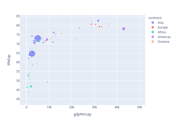
Jsulopzs's interactive graph and data of "lifeExp vs gdpPercap" is a scatter chart, showing Asia, Europe, Africa, Americas, Oceania; with gdpPercap in the x-axis and lifeExp in the y-axis.. The x-axis shows values from 0 to 0. The y-axis shows values from 0 to 0.