Edit chart
Loading graph
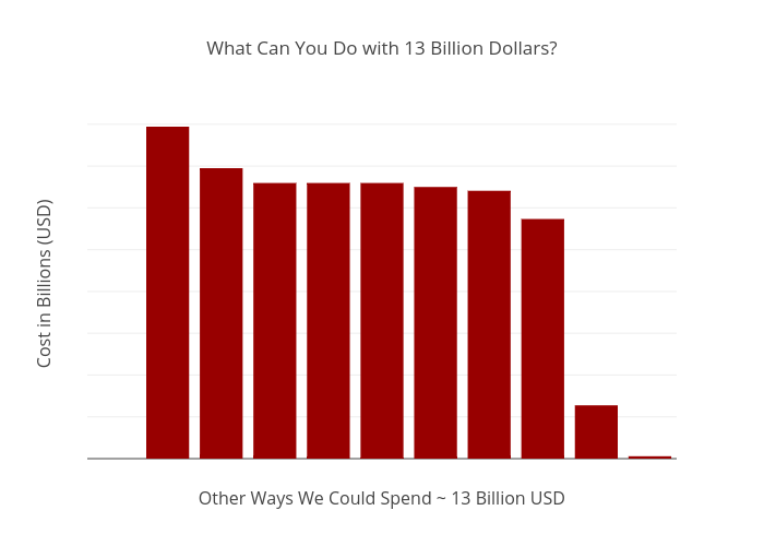
Jmareane's interactive graph and data of "What Can You Do with 13 Billion Dollars?" is a bar chart, showing Dollars (Billions); with Other Ways We Could Spend ~ 13 Billion USD in the x-axis and Cost in Billions (USD) in the y-axis.. The x-axis shows values from 0.5 to 10.5. The y-axis shows values from 0 to 16.722052631578947.