Edit chart
Loading graph
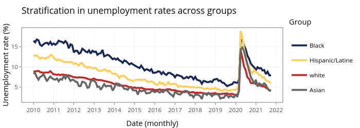
Jayalakc's interactive graph and data of "Stratification in unemployment rates across groups" is a filled line chart, showing Black, Hispanic/Latine, white, Asian; with Date (monthly) in the x-axis and Unemployment rate (%) in the y-axis.. The x-axis shows values from 14395.45 to 19115.55. The y-axis shows values from 1.155 to 19.745. This visualization has the following annotation: Group