Edit chart
Loading graph
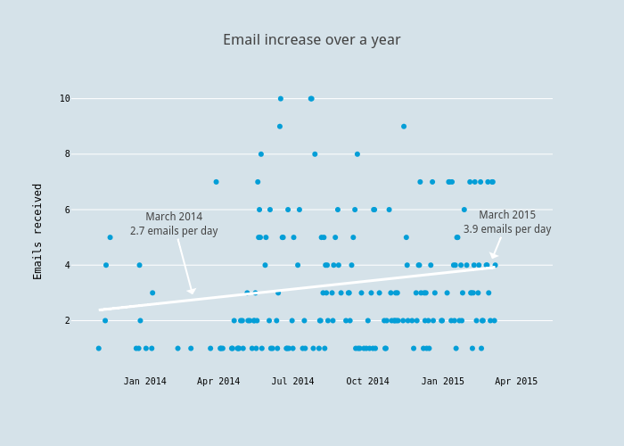
Jackp's interactive graph and data of "Email increase over a year" is a scatter chart, showing trace 0 - fit; with Emails received in the y-axis. The x-axis shows values from 1380910619063.477 to 1430011842672.1057. The y-axis shows values from 0.05328699681436411 to 10.34118012939687. This visualization has the following annotations: March 20153.9 emails per day; March 20142.7 emails per day