Edit chart
Loading graph
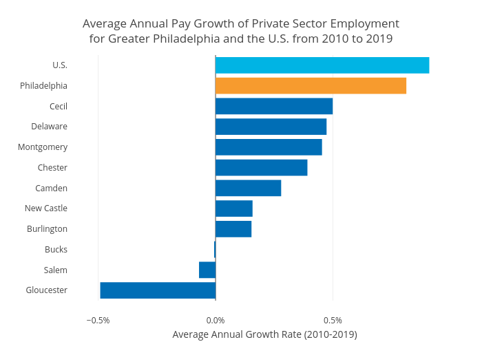
Hbajwa1's interactive graph and data of "Average Annual Pay Growth of Private Sector Employmentfor Greater Philadelphia and the U.S. from 2010 to 2019" is a bar chart; with Average Annual Growth Rate (2010-2019) in the x-axis. The x-axis shows values from 0 to 0. The y-axis shows values from 0 to 0.