Edit chart
Loading graph
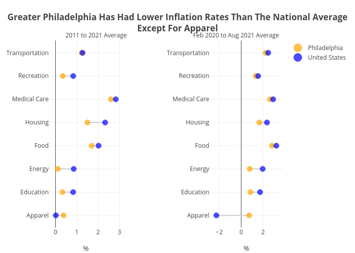
Hbajwa1's interactive graph and data of "Greater Philadelphia Has Had Lower Inflation Rates Than The National AverageExcept For Apparel" is a line chart, showing Philadelphia, United States, Philadelphia, United States; with % in the x-axis. The x-axis shows values from 0 to 0. The y-axis shows values from 0 to 0. This visualization has the following annotations: 2011 to 2021 Average; Feb 2020 to Aug 2021 Average