Edit chart
Loading graph
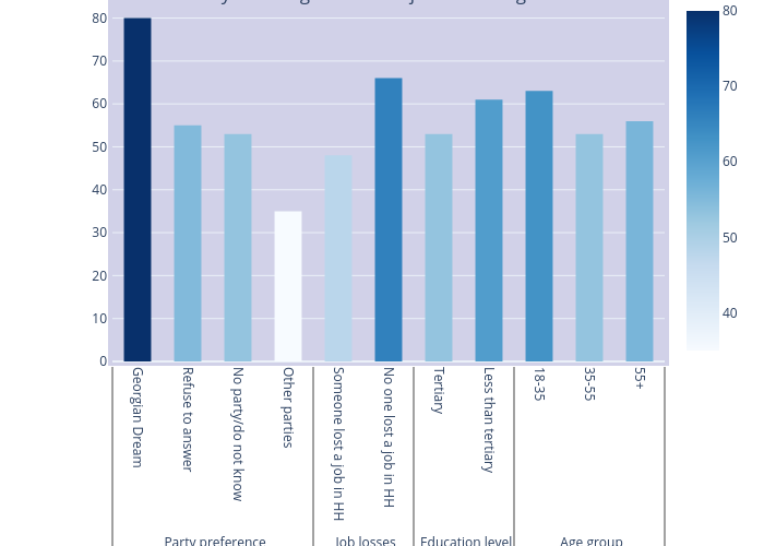
Givisil's interactive graph and data of "Has our country done a good or bad job in dealing with coronavirus outbreak? by partisanship and socio-demographic characteristics (Predicted probability)" is a bar chart. The x-axis shows values from -0.5 to 10.5. The y-axis shows values from 0 to 84.21052631578948.