Edit chart
Loading graph
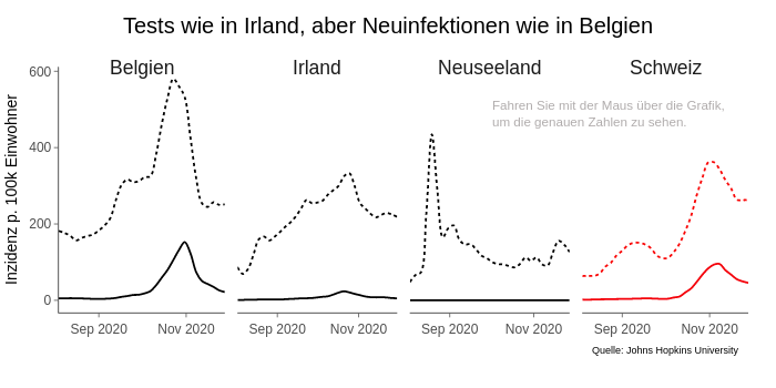
Florian.eblenkamp's interactive graph and data of "Tests wie in Irland, aber Neuinfektionen wie in Belgien" is a line chart, showing Neuinfektionen, Neuinfektionen, Neuinfektionen, Neuinfektionen, Tests, Tests, Tests, Tests; with in the x-axis and Inzidenz p. 100k Einwohner in the y-axis.. The x-axis shows values from 2020-08-04 to 2020-11-28. The y-axis shows values from -32.234540356547505 to 612.5155753976068. This visualization has the following annotations: Belgien; Irland; Neuseeland; Schweiz; Fahren Sie mit der Maus über die Grafik,um die genauen Zahlen zu sehen.