Edit chart
Loading graph
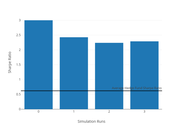
F_midd01's interactive graph and data of "Sharpe Ratio vs Simulation Runs" is a bar chart; with Simulation Runs in the x-axis and Sharpe Ratio in the y-axis.. The x-axis shows values from 0 to 0. The y-axis shows values from 0 to 0. This visualization has the following annotation: Average Hedge Fund Sharpe Ratio