Edit chart
Loading graph
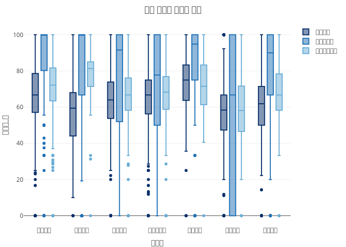
Estndard's interactive graph and data of "대학 계열별 취업률 분포" is a box plot, showing 대학과정, 대학원과정, 전문대학과정; with 대계열 in the x-axis and 취업률_계 in the y-axis.. The x-axis shows values from 0 to 0. The y-axis shows values from 0 to 0.