Edit chart
Loading graph
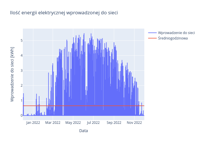
Ekordo's interactive graph and data of "Ilość energii elektrycznej wprowadzonej do sieci" is a line chart, showing Wprowadzenie do sieci vs Średniogodzinowa; with Data in the x-axis and Wprowadzenie do sieci [kWh] in the y-axis.. The x-axis shows values from 0 to 0. The y-axis shows values from 0 to 0.