Edit chart
Loading graph
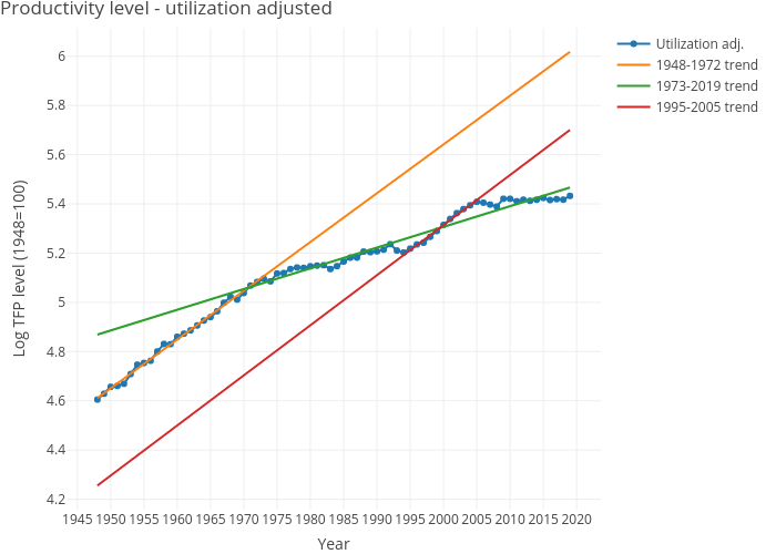
Dvollrath's interactive graph and data of "Productivity level - utilization adjusted" is a line chart, showing Utilization adj., 1948-1972 trend, 1973-2019 trend, 1995-2005 trend; with Year in the x-axis and Log TFP level (1948=100) in the y-axis.. The x-axis shows values from 0 to 0. The y-axis shows values from 0 to 0.