Edit chart
Loading graph
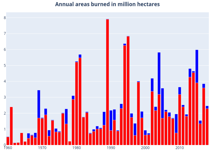
Dlmore's interactive graph and data of "Annual areas burned in million hectares" is a , showing CAN vs AK; with {} in the x-axis and {} in the y-axis.. The x-axis shows values from 0 to 0. The y-axis shows values from 0 to 0.