Edit chart
Loading graph
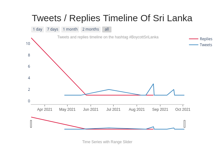
Dfracdeveloper's interactive graph and data of "Replies vs Tweets" is a line chart, showing Replies vs Tweets. The x-axis shows values from 0 to 0. The y-axis shows values from 0 to 0. This visualization has the following annotations: ; ; ; ; Tweets / Replies Timeline Of Sri Lanka; Tweets and replies timeline on the hashtag #BoycottSriLanka; Time Series with Range Slider