Edit chart
Loading graph
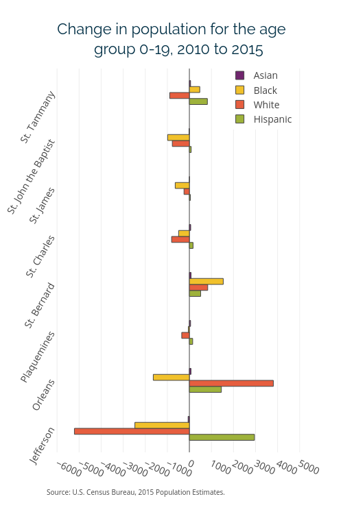
Datacenter's interactive graph and data of "Change in population for the age " is a bar chart, showing Hispanic, White, Black, Asian. The x-axis shows values from -6100 to 5100. The y-axis shows values from -0.5 to 7.5. This visualization has the following annotations: Source: U.S. Census Bureau, 2015 Population Estimates.; group 0-19, 2010 to 2015