Edit chart
Loading graph
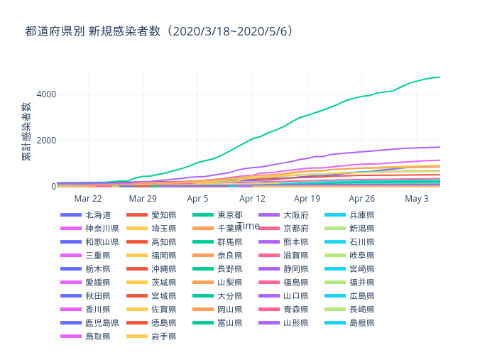
Daigomiyoshi's interactive graph and data of "都道府県別 新規感染者数(2020/3/18~2020/5/6)" is a line chart; with Time in the x-axis and 累計感染者数 in the y-axis.. The x-axis shows values from 2020-03-18 to 2020-05-06. The y-axis shows values from -263.77777777777777 to 5011.777777777777.