Edit chart
Loading graph
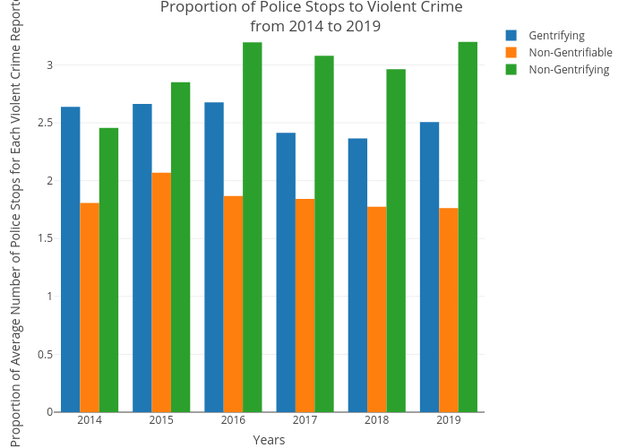
Csmith790's interactive graph and data of "Proportion of Police Stops to Violent Crime from 2014 to 2019" is a bar chart, showing Gentrifying, Non-Gentrifiable, Non-Gentrifying; with Years in the x-axis and Proportion of Average Number of Police Stops for Each Violent Crime Reported in the y-axis.. The x-axis shows values from 0 to 0. The y-axis shows values from 0 to 0.