Edit chart
Loading graph
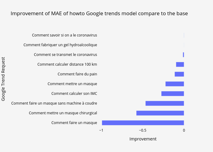
Covidtrends's interactive graph and data of "Improvement of MAE of howto Google trends model compare to the base" is a bar chart; with Improvement in the x-axis and Google Trend Request in the y-axis.. The x-axis shows values from 0 to 0. The y-axis shows values from 0 to 0.