Edit chart
Loading graph
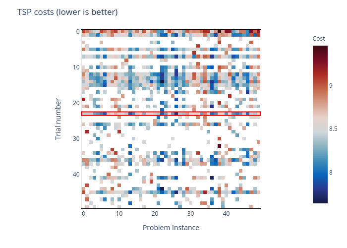
Contramundum53's interactive graph and data of "TSP costs (lower is better)" is a heatmap, showing 0; with Problem Instance in the x-axis and Trial number in the y-axis.. The x-axis shows values from 0 to 0. The y-axis shows values from 0 to 0.