Edit chart
Loading graph
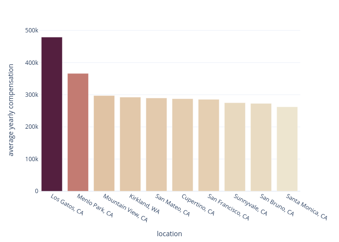
Chaeyun1248's interactive graph and data of "average yearly compensation vs location" is a bar chart; with location in the x-axis and average yearly compensation in the y-axis.. The x-axis shows values from 0 to 0. The y-axis shows values from 0 to 0.