Edit chart
Loading graph
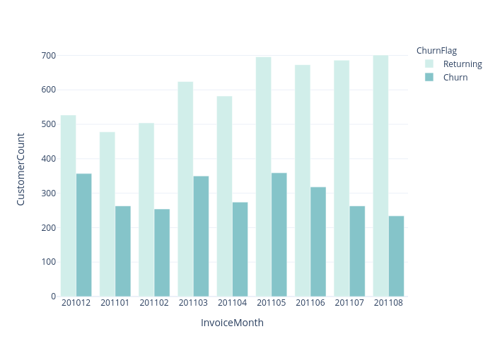
Chaeyun1248's interactive graph and data of "CustomerCount vs InvoiceMonth" is a grouped bar chart, showing Returning vs Churn; with InvoiceMonth in the x-axis and CustomerCount in the y-axis.. The x-axis shows values from 0 to 0. The y-axis shows values from 0 to 0.