Edit chart
Loading graph
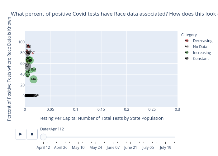
Brianwilliams2022's interactive graph and data of "What percent of positive Covid tests have Race data associated? How does this look over time in each state?" is a , showing Decreasing, No Data, Increasing, Constant; with Testing Per Capita: Number of Total Tests by State Population in the x-axis and Percent of Positive Tests where Race Data is Known in the y-axis.. The x-axis shows values from 0 to 0.3. The y-axis shows values from -20 to 120.