Edit chart
Loading graph
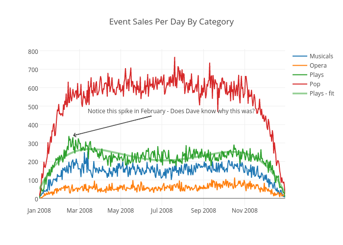
Bill_chambers's interactive graph and data of "Event Sales Per Day By Category" is a scatter chart, showing Musicals, Opera, Plays, Pop, Plays - fit; with time in the x-axis. The x-axis shows values from 1199174400000 to 1230710400000. The y-axis shows values from -40.5 to 809.5. This visualization has the following annotation: Notice this spike in February - Does Dave know why this was?