Edit chart
Loading graph
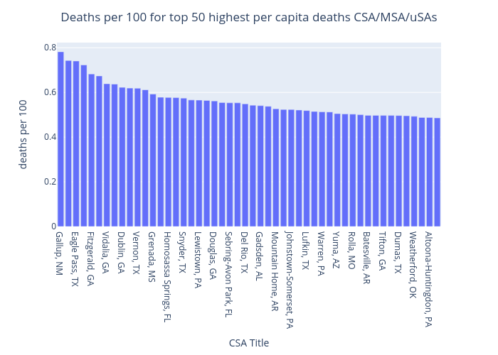
Benhsia's interactive graph and data of "Deaths per 100 for top 50 highest per capita deaths CSA/MSA/uSAs" is a bar chart; with CSA Title in the x-axis and deaths per 100 in the y-axis.. The x-axis shows values from 0 to 0. The y-axis shows values from 0 to 0.