Edit chart
Loading graph
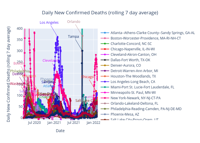
Benhsia's interactive graph and data of "Daily New Confirmed Deaths (rolling 7 day average)" is a , showing Atlanta--Athens-Clarke County--Sandy Springs, GA-AL, Boston-Worcester-Providence, MA-RI-NH-CT, Charlotte-Concord, NC-SC, Chicago-Naperville, IL-IN-WI, Cleveland-Akron-Canton, OH, Dallas-Fort Worth, TX-OK, Denver-Aurora, CO, Detroit-Warren-Ann Arbor, MI, Houston-The Woodlands, TX, Los Angeles-Long Beach, CA, Miami-Port St. Lucie-Fort Lauderdale, FL, Minneapolis-St. Paul, MN-WI, New York-Newark, NY-NJ-CT-PA, Orlando-Lakeland-Deltona, FL, Philadelphia-Reading-Camden, PA-NJ-DE-MD, Phoenix-Mesa, AZ, Salt Lake City-Provo-Orem, UT, San Antonio-New Braunfels-Pearsall, TX, San Diego-Chula Vista-Carlsbad, CA, San Jose-San Francisco-Oakland, CA, Seattle-Tacoma, WA, St. Louis-St. Charles-Farmington, MO-IL, Tampa-St. Petersburg-Clearwater, FL, Washington-Baltimore-Arlington, DC-MD-VA-WV-PA; with Date in the x-axis and Daily New Confirmed Deaths (rolling 7 day average) in the y-axis.. The x-axis shows values from 2020-03-15 to 2022-02-09. The y-axis shows values from -10 to 400. This visualization has the following annotations: Atlanta; Boston; Charlotte; Chicago; Cleveland; Dallas; Denver; Detroit; Houston; Los Angeles; Miami; Minneapolis; New York; Orlando; Philadelphia; Phoenix; Salt Lake City; San Antonio; San Diego; San Jose; Seattle; St. Louis; Tampa; Washington