Edit chart
Loading graph
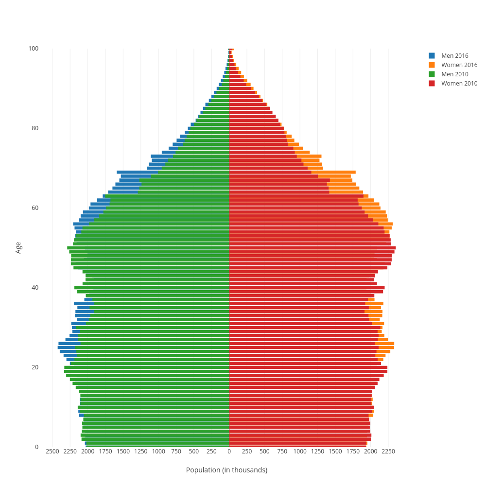
Bdorsey2's interactive graph and data of "Age vs Population (in thousands)" is a overlaid bar chart, showing Men 2016, Women 2016, Men 2010, Women 2010; with Population (in thousands) in the x-axis and Age in the y-axis.. The x-axis shows values from 0 to 0. The y-axis shows values from 0 to 100.