Edit chart
Loading graph
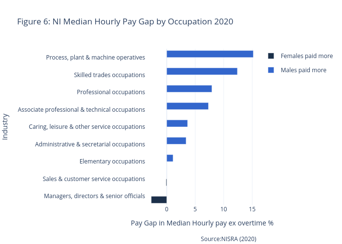
Astennett's interactive graph and data of "Figure 6: NI Median Hourly Pay Gap by Occupation 2020" is a bar chart, showing Females paid more vs Males paid more; with Pay Gap in Median Hourly pay ex overtime % in the x-axis and Industry in the y-axis.. The x-axis shows values from 0 to 0. The y-axis shows values from 0 to 0. This visualization has the following annotation: Source:NISRA (2020)