Edit chart
Loading graph
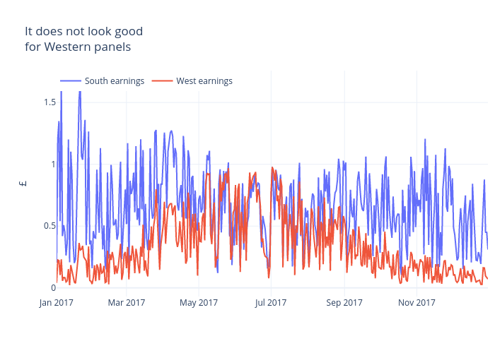
Archy.deberker's interactive graph and data of "It does not look goodfor Western panels" is a line chart, showing South earnings vs West earnings; with {} in the x-axis and £ in the y-axis.. The x-axis shows values from 0 to 0. The y-axis shows values from 0 to 0.