Edit chart
Loading graph
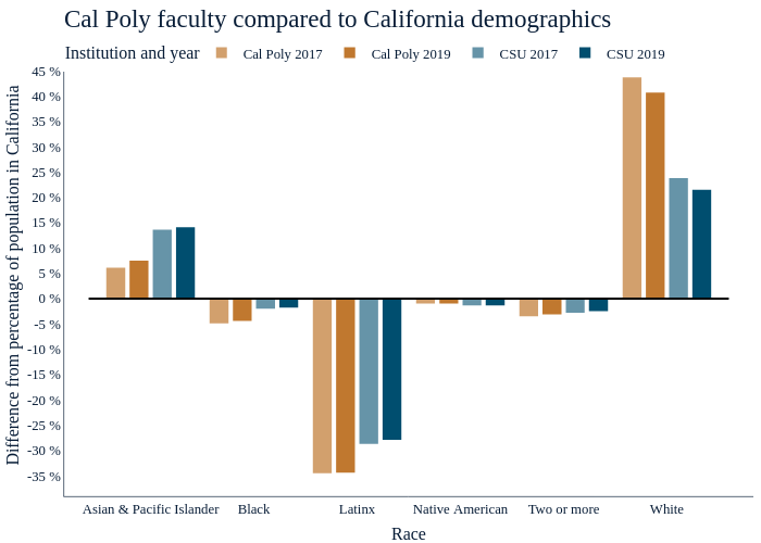
Amcgloin's interactive graph and data of "Cal Poly faculty compared to California demographics" is a , showing Cal Poly 2017, Cal Poly 2019, CSU 2017, CSU 2019; with Race in the x-axis and Difference from percentage of population in California in the y-axis.. The x-axis shows values from 0.1625000000000002 to 6.8375. The y-axis shows values from -39.06666666666667 to 48.266666666666666. This visualization has the following annotation: Year