Edit chart
Loading graph
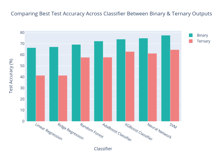
Acpoll's interactive graph and data of "Comparing Best Test Accuracy Across Classifier Between Binary & Ternary Outputs" is a grouped bar chart, showing Binary vs Ternary; with Classifier in the x-axis and Test Accuracy (%) in the y-axis.. The x-axis shows values from -0.5 to 6.5. The y-axis shows values from 0 to 81.68421052631578.