Edit chart
Loading graph
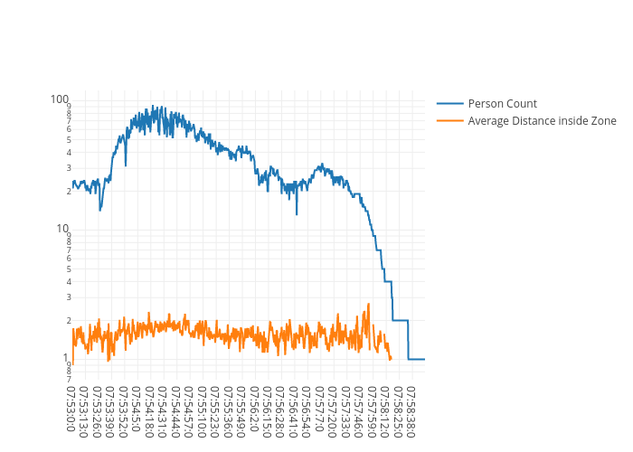
Shaggysanchez's interactive graph and data of "Person Count vs Average Distance inside Zone" is a scatter chart, showing Person Count vs Average Distance inside Zone. The x-axis shows values from 0 to 0. The y-axis shows values from 0 to 0.