Edit chart
Loading graph
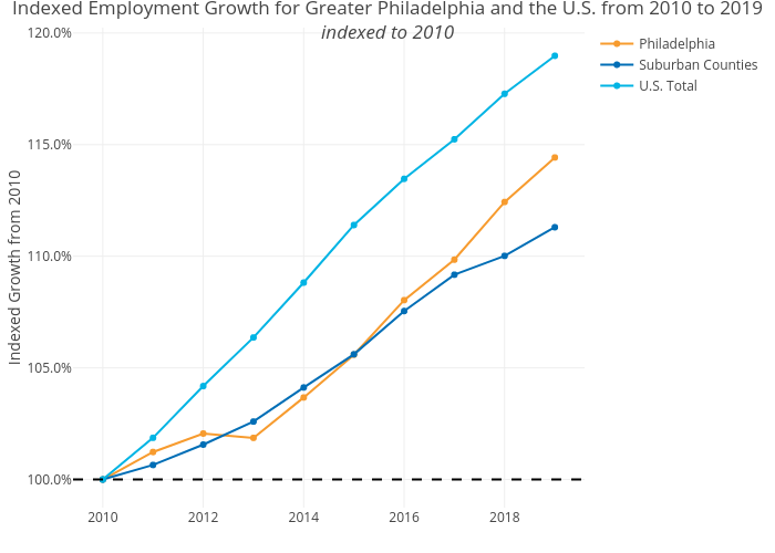
Shausnerlevine's interactive graph and data of "Indexed Employment Growth for Greater Philadelphia and the U.S. from 2010 to 2019indexed to 2010" is a line chart, showing Philadelphia, Suburban Counties, U.S. Total; with Indexed Growth from 2010 in the y-axis. The x-axis shows values from 0 to 0. The y-axis shows values from 0 to 0.