Edit chart
Loading graph
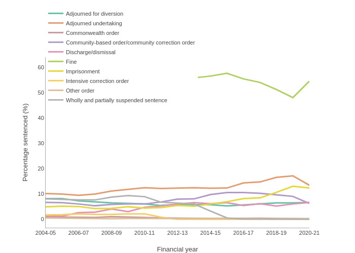
Sac's interactive graph and data of " " is a line chart, showing Adjourned for diversion, Adjourned undertaking , Commonwealth order, Community-based order/community correction order, Discharge/dismissal, Fine, Imprisonment, Intensive correction order, Other order, Wholly and partially suspended sentence; with Financial year in the x-axis and Percentage sentenced (%) in the y-axis.. The x-axis shows values from 2004-05 to 2018-19. The y-axis shows values from 0 to 0.