Edit chart
Loading graph
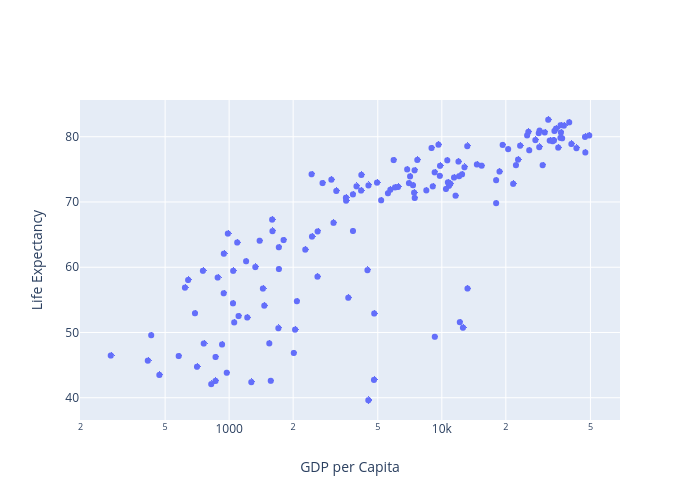
Pythonplotbot's interactive graph and data of "Life Expectancy vs GDP per Capita" is a scatter chart, showing 2007; with GDP per Capita in the x-axis and Life Expectancy in the y-axis.. The x-axis shows values from 0 to 0. The y-axis shows values from 0 to 0.