Edit chart
Loading graph
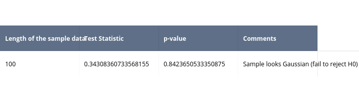
Pythonplotbot's interactive graph and data is a heatmap. The x-axis shows values from 0 to 0. The y-axis shows values from 0 to 0. This visualization has the following annotations: Length of the sample data; Test Statistic; p-value; Comments; 100; 0.34308360733568155; 0.8423650533350875; Sample looks Gaussian (fail to reject H0)