Edit chart
Loading graph
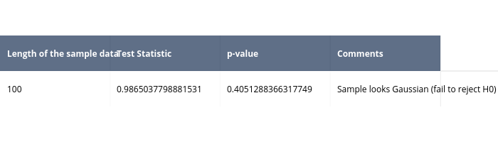
Pythonplotbot's interactive graph and data is a heatmap. The x-axis shows values from 0 to 0. The y-axis shows values from 0 to 0. This visualization has the following annotations: Length of the sample data; Test Statistic; p-value; Comments; 100; 0.9865037798881531; 0.4051288366317749; Sample looks Gaussian (fail to reject H0)