Edit chart
Loading graph
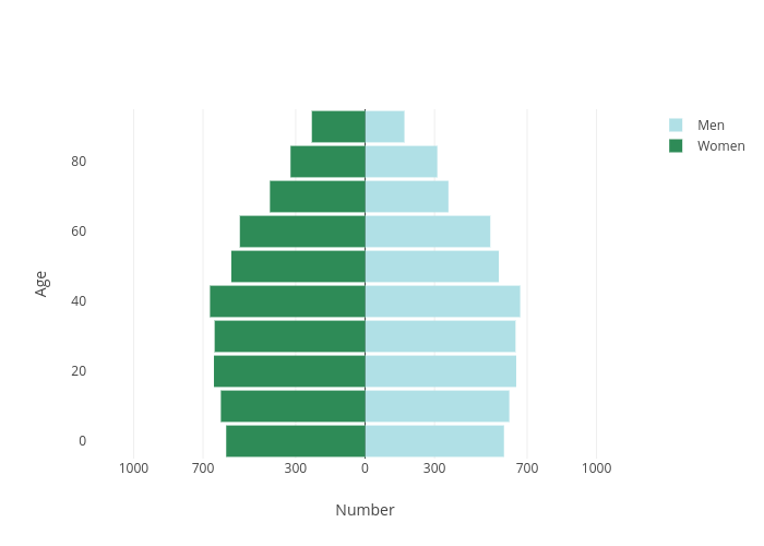
Pythonplotbot's interactive graph and data of "Age vs Number" is a , showing Men vs Women; with Number in the x-axis and Age in the y-axis.. The x-axis shows values from -1200 to 1200. The y-axis shows values from 0 to 0.