Edit chart
Loading graph
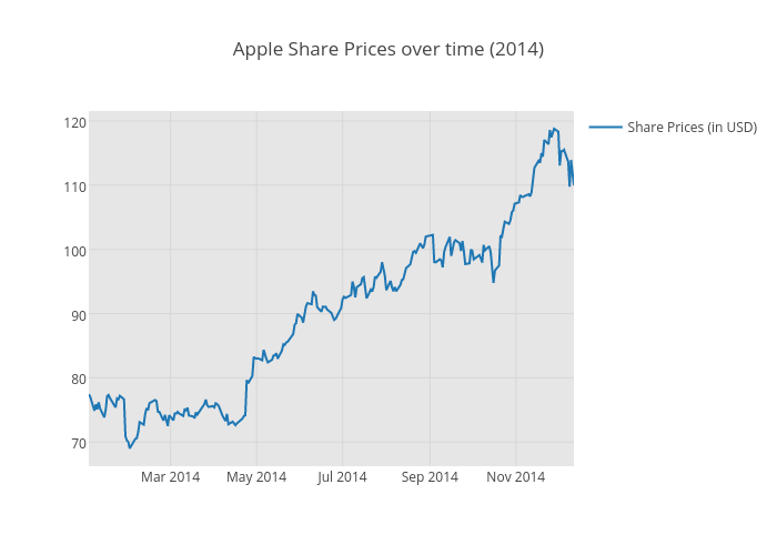
Pythonplotbot's interactive graph and data of "Apple Share Prices over time (2014)" is a scatter chart, showing Share Prices (in USD). The x-axis shows values from 0 to 0. The y-axis shows values from 0 to 0.