Edit chart
Loading graph
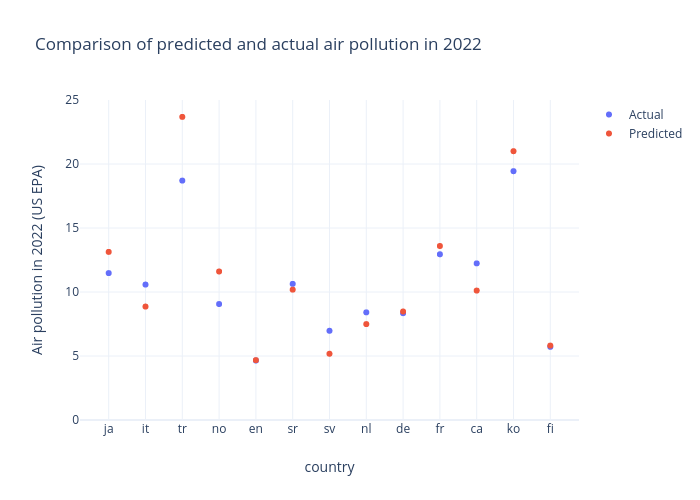
Mrzaiko's interactive graph and data of "Comparison of predicted and actual air pollution in 2022" is a scatter chart, showing Actual vs Predicted; with country in the x-axis and Air pollution in 2022 (US EPA) in the y-axis.. The x-axis shows values from -0.7613636363636364 to 12.761363636363637. The y-axis shows values from 0 to 25.