Edit chart
Loading graph
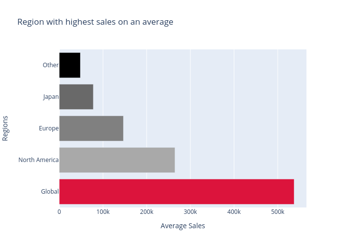
Lehak_narnauli's interactive graph and data of "Region with highest sales on an average" is a bar chart; with Average Sales in the x-axis and Regions in the y-axis.. The x-axis shows values from 0 to 0. The y-axis shows values from 0 to 0.