Edit chart
Loading graph
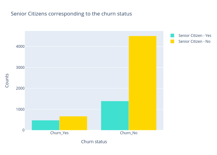
Lehak_narnauli's interactive graph and data of "Senior Citizens corresponding to the churn status" is a grouped bar chart, showing Senior Citizen - Yes vs Senior Citizen - No; with Churn status in the x-axis and Counts in the y-axis.. The x-axis shows values from 0 to 0. The y-axis shows values from 0 to 0.