Edit chart
Loading graph
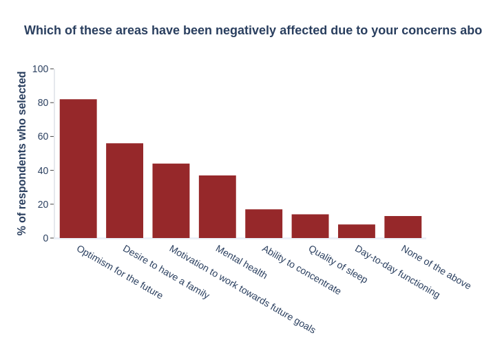
L_e_bell's interactive graph and data of "Which of these areas have been negatively affected due to your concerns about the climate crisis?" is a bar chart; with {'font': {'size': 6}} in the x-axis and % of respondents who selected in the y-axis.. The x-axis shows values from -0.5 to 7.5. The y-axis shows values from 0 to 100.