Edit chart
Loading graph
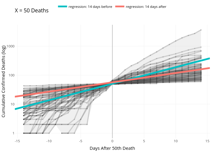
Griffink's interactive graph and data of "X = 50 Deaths" is a line chart, showing regression: 14 days before vs regression: 14 days after; with Days After 50th Death in the x-axis and Cumulative Confirmed Deaths (log) in the y-axis.. The x-axis shows values from -15.4 to 15.4. The y-axis shows values from -0.177965400545351 to 3.73727341145236.