Edit chart
Loading graph
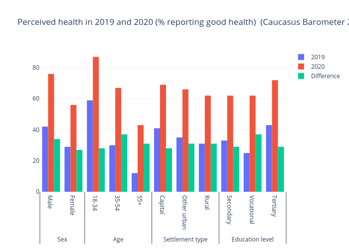
Gilbreathdustin's interactive graph and data of "Perceived health in 2019 and 2020 (% reporting good health) (Caucasus Barometer 2019 and 2020)" is a bar chart, showing 2019, 2020, Difference. The x-axis shows values from -0.5 to 10.5. The y-axis shows values from 0 to 91.57894736842105.