Edit chart
Loading graph
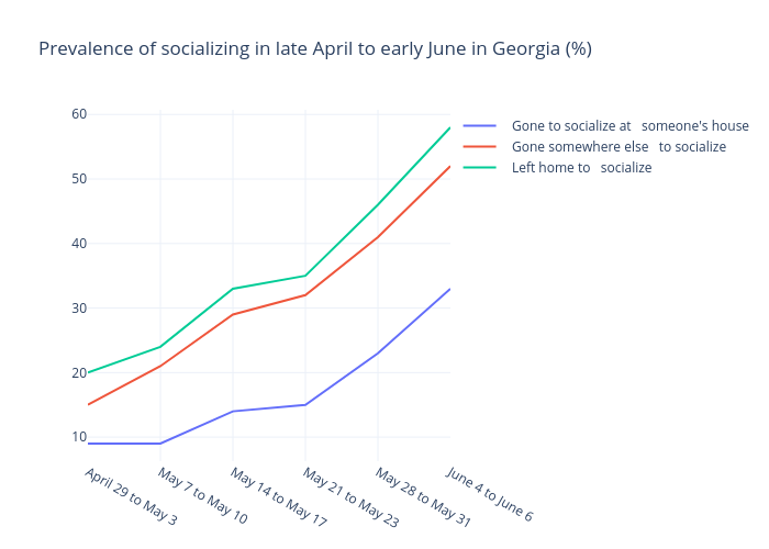
Gilbreathdustin's interactive graph and data of "Prevalence of socializing in late April to early June in Georgia (%)" is a line chart, showing Gone to socialize at someone's house, Gone somewhere else to socialize , Left home to socialize. The x-axis shows values from 0 to 5. The y-axis shows values from 6.277777777777779 to 60.72222222222222.