Edit chart
Loading graph
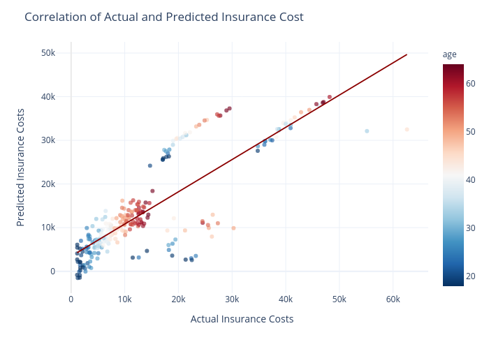
Gokhandede's interactive graph and data of "Correlation of Actual and Predicted Insurance Cost" is a scatter chart, showing vs ; with Actual Insurance Costs in the x-axis and Predicted Insurance Costs in the y-axis.. The x-axis shows values from 0 to 0. The y-axis shows values from 0 to 0.