Edit chart
Loading graph
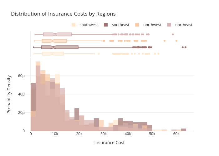
Gokhandede's interactive graph and data of "Distribution of Insurance Costs by Regions" is a histogram, showing southwest, southwest, southeast, southeast, northwest, northwest, northeast, northeast; with Insurance Cost in the x-axis and Probability Density in the y-axis.. The x-axis shows values from 0 to 0. The y-axis shows values from 0 to 0.