Edit chart
Loading graph
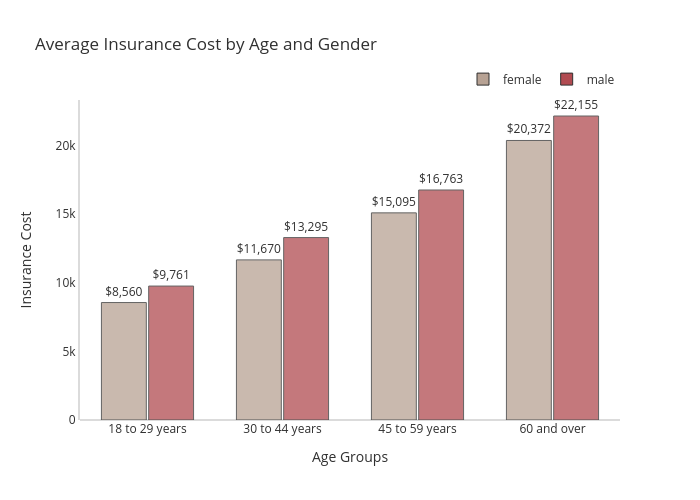
Gokhandede's interactive graph and data of "Average Insurance Cost by Age and Gender" is a grouped bar chart, showing female vs male; with Age Groups in the x-axis and Insurance Cost in the y-axis.. The x-axis shows values from 0 to 0. The y-axis shows values from 0 to 0.