Edit chart
Loading graph
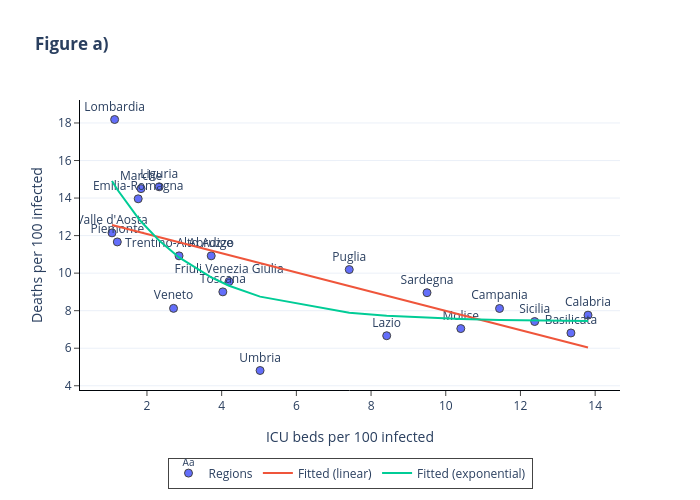
Fedegall's interactive graph and data of "Figure a)" is a , showing Regions, Fitted (linear), Fitted (exponential); with ICU beds per 100 infected in the x-axis and Deaths per 100 infected in the y-axis.. The x-axis shows values from 0.2879568833221575 to 14.584533116677843. The y-axis shows values from 3.861303584693304 to 19.137116415306696.