Edit chart
Loading graph
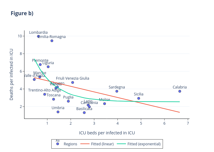
Fedegall's interactive graph and data of "Figure b)" is a , showing Regions, Fitted (linear), Fitted (exponential); with ICU beds per infected in ICU in the x-axis and Deaths per infected in ICU in the y-axis.. The x-axis shows values from 0.06653347358942435 to 7.030084926410575. The y-axis shows values from 0.721141514542445 to 10.567128485457554.